Using an LLM to draft static infographics with Remotion
Every internal announcement starts the same way. You open a blank canvas, pick a layout, fight with alignment, and ship something that looks like it took longer than it should have. For a one-off policy notice or event flyer, that is rarely worth doing by hand.
I found a small workflow that skips most of that tax, and I've been genuinely happy using it, so I wanted to write it up. It doesn't replace anything or rework how I work. It's just a nice little shortcut: an LLM turns a rough source document into a structured static infographic, rendered by Remotion, a framework built for programmatically generating video that also happens to render a single still frame just fine.
Why Remotion and not Canva or Figma
Remotion isn't a competitor to Canva or Figma here. It's a first draft.
Canva and Figma assume a human clicking through a UI. Remotion is a React component rendered to an image, so you can call it from a script, a cron job, or an LLM's tool loop with no human in the middle. That's the entire point of pairing it with an LLM in the first place: programmatic means automatable.
A model that's seen millions of React components is far better at writing and modifying a Remotion component than it is at driving a Figma plugin API or a Canva integration it's rarely been trained against.
The output is a fast, data-driven boilerplate: a real starting layout, not a polished final asset. If something needs to look genuinely designed, a Canva or Figma user can still pick it up from there. This workflow just means nobody has to start from nothing, and honestly, not starting from nothing is most of the battle for me.
The setup
The source material was a photographed community circular, a condo association's printed notice about weather and safety guidelines for a Sunday fun run. A photo of a physical letterhead document, the kind of thing that actually accumulates in a shared drive, not typed notes or a JSON blob.
The prompt was one line, handed to an LLM already working inside the Remotion project's codebase:
generate a static mobile formatted announcement based on
reference/fun-run-guidelines.jpg. follow our established CTA patterns
No files were pointed to directly. "Established CTA patterns" was left for the model to figure out on its own. Kind of a mean thing to do to it, honestly, but that was the point.
How it found the pattern
This part is my favorite part to watch, every time. The model read Root.tsx first and learned that static posters in this codebase are registered as Remotion <Still> compositions, distinct from animated <Composition> entries sitting next to them. From there it found an existing poster component and used it as a structural template: letterhead band, headline, highlighted panel, call-to-action block, footer. It pulled the shared color palette and font loader from the theme file, and sampled a sibling component to see how time-sensitive information gets styled: a red rounded block with a muted label and large white value.
Here's the letterhead and pickup-window block from the shipped component. Names, circular number, and location are fictionalized for this post; the JSX structure and styling are exactly what shipped:
<div style={{backgroundColor: C.greenDark, padding: '34px 60px', textAlign: 'center'}}>
  <div style={{fontSize: 32, fontWeight: 800, color: '#FFFFFF', letterSpacing: 3}}>
    RIVERBEND COMMONS CONDOMINIUM ASSOCIATION
  </div>
  <div style={{fontSize: 24, fontWeight: 600, color: '#DCEEE2', marginTop: 8}}>
    Property Management Office · Circular RBC-CIR-2026-007-053
  </div>
</div>

{/* Kit pick-up window — red urgency block, reused from a sibling component */}
<div style={{backgroundColor: C.red, borderRadius: 20, padding: '30px 48px', textAlign: 'center'}}>
  <div style={{fontSize: 34, fontWeight: 600, color: '#FFD9D9'}}>
    Runner kit & attendance pick-up
  </div>
  <div style={{fontSize: 58, fontWeight: 800, color: '#FFFFFF', marginTop: 8}}>
    5:00 – 5:40 AM
  </div>
  <div style={{fontSize: 29, fontWeight: 600, color: '#FFFFFF', marginTop: 10}}>
    Covered area outside the clubhouse east gate entrance
  </div>
</div>
None of that was pointed to explicitly. It was inferred by reading the codebase, and it was only inferable because the components carried comments that explained intent, not just structure. One theme file had a note that a given component should read as part of the same visual family as its siblings. That comment did real work as a design-system spec for a future LLM pass, not just documentation for a human reader.
If you want an LLM to infer your conventions, the conventions have to be written down somewhere it can read them. Consistent code shape alone isn't enough, because a model can't always tell the difference between "this is the pattern" and "this is just how this one file happened to be written."
Two passes, not one
The first generation typechecked cleanly and rendered without error. It also silently overflowed the canvas: the call-to-action block and footer were clipped off the bottom of the fixed 1920px frame. Nothing in the tooling caught it. A type check and a successful render both say nothing about whether the layout actually fits.
The second pass fixed the overflow, and only that. No copy changed, just spacing and type scale came down across the board, which felt a little humbling for a poster about attending a fun run:
| Element | First pass | Shipped |
|---|---|---|
| Headline size | 84px | 78px |
| CTA block padding | 32×80px | 28×56px |
| Deadline block time size | 64px | 58px |
The model inspected its own rendered PNG output and caught the overflow itself. This was a two-shot result with self-correction, not a one-shot success, and that matters, since rounding it up to "it nailed it on the first try" would misrepresent how the workflow behaves.
The result
Here's what came out the other end, and I still think it's kind of neat:
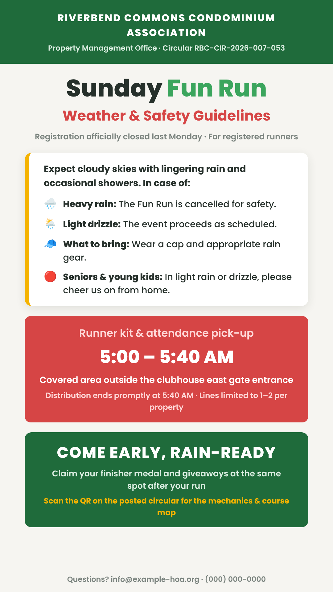
The names, circular number, and contact details above are fictional, swapped in for this post. The layout, copy, and structure are exactly what the model shipped.
Where this actually breaks
Five limitations worth knowing before you trust this for something that matters.
1. Overflow fails silently
A typecheck passing and a render completing tell you nothing about whether the layout fits inside its own canvas. Looking at the rendered image is the only reliable check. If that step gets skipped, a clipped result ships looking exactly as "successful" as a correct one.
2. Fidelity checks catch wrong text, not missing text
The shipped poster never states which Sunday the event is on. The source circular had a date; the poster doesn't. Every individual fact that made it in was accurate. The miss was something the model didn't know it had dropped. Reviewing correctness isn't the same as reviewing completeness.
3. The pattern-matching relied on groundwork
This worked because the codebase had comments explaining design intent, not just code. Without that foundation, "follow our established patterns" degrades into the model guessing.
4. The session had twists
Partway through, the work shifted into a planning step for the remaining work. The actual path from prompt to poster is rarely as linear as a retelling makes it sound.
5. Invented copy needs approval
The call-to-action line on the shipped poster wasn't in the source circular. The model wrote it because the pattern called for one. It's an improvement, but it's also not a faithful reproduction of the official notice anymore. For anything representing a real organization, synthesized copy needs sign-off before it goes out as that organization's voice.
Where this leaves off
This is not faster than Canva. It's faster than a blank canvas, and a human still finishes the job. For low-stakes internal announcements, that trade works. Once the stakes rise, say an official notice or anything customer-facing, the review step stops being optional and becomes most of the work.
This is the static case. The same project also produces short animated pieces, which come with a different set of tradeoffs. That's a different post.